

01
Existing Brand
The logo couldn’t change, so everything had to be built around it.
We are based in
Lancaster, PA and
work remotely.
We are based in
Lancaster, PA and
work remotely.
We are based in
Lancaster, PA and
work remotely.
We are based in
Lancaster, PA and
work remotely.
Restaurant Branding
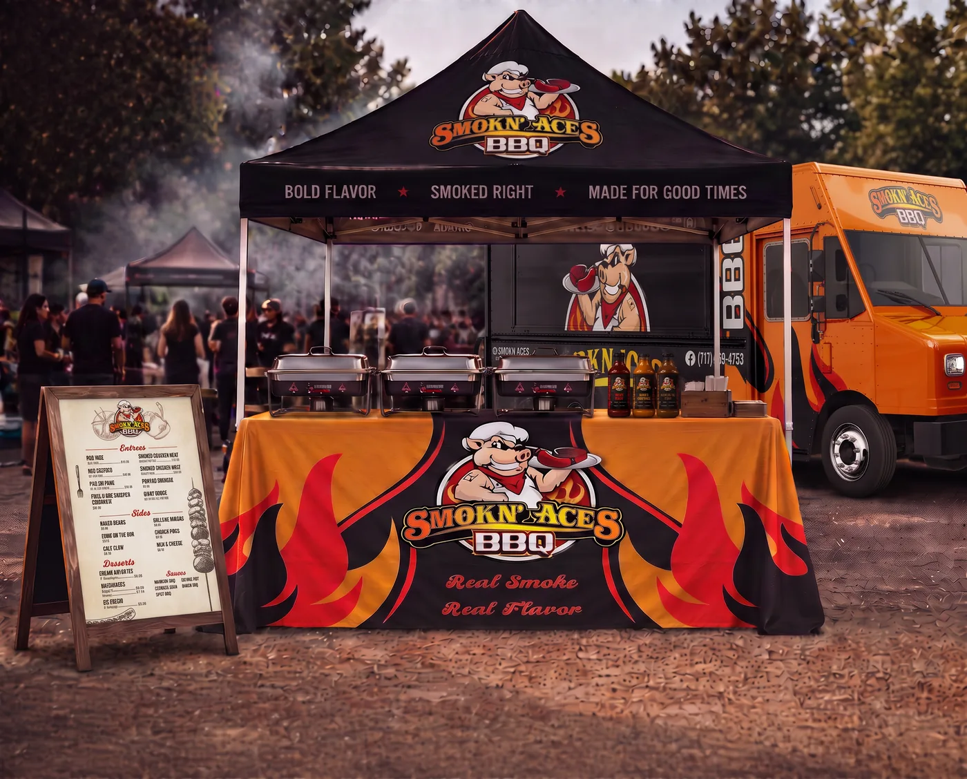
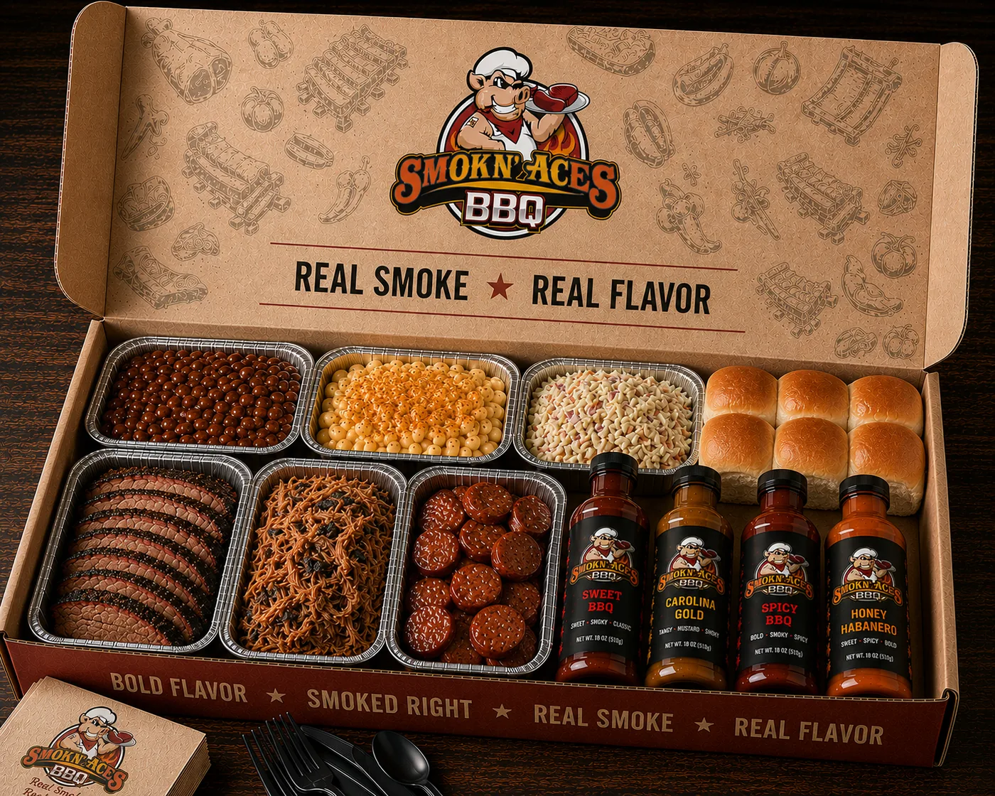
An established BBQ brand with a bold personality. We expanded its existing identity into one system across the food truck, menus, packaging, signage, and merchandise, keeping the character customers already knew.
Client
Smokn’ Aces
Deliverables
Brand Identity
Services
Brand Strategy
Print Design
Environmental Design
Packaging
Restaurant Branding
An established BBQ brand with a bold personality. We expanded its existing identity into one system across the food truck, menus, packaging, signage, and merchandise, keeping the character customers already knew.
Client
Smokn’ Aces
Deliverables
Brand Identity
Services
Brand Strategy
Print Design
Environmental Design
Packaging
Restaurant Branding
An established BBQ brand with a bold personality. We expanded its existing identity into one system across the food truck, menus, packaging, signage, and merchandise, keeping the character customers already knew.
Client
Smokn’ Aces
Deliverables
Brand Identity
Services
Brand Strategy
Print Design
Environmental Design
Packaging
The business already had an established logo that customers recognized. The goal was to build a cohesive brand system around it.
A visual system that extends the existing logo so it works across every touchpoint, stays familiar to customers, and reflects the bold flavors of the food.
A unified brand experience that strengthens recognition, builds loyalty, and looks great in both mobile and brick-and-mortar settings.
The business already had an established logo that customers recognized. The goal was to build a cohesive brand system around it.
A visual system that extends the existing logo so it works across every touchpoint, stays familiar to customers, and reflects the bold flavors of the food.
A unified brand experience that strengthens recognition, builds loyalty, and looks great in both mobile and brick-and-mortar settings.
The business already had an established logo that customers recognized. The goal was to build a cohesive brand system around it.
A visual system that extends the existing logo so it works across every touchpoint, stays familiar to customers, and reflects the bold flavors of the food.
A unified brand experience that strengthens recognition, builds loyalty, and looks great in both mobile and brick-and-mortar settings.
01
The logo couldn’t change, so everything had to be built around it.
01
The logo couldn’t change, so everything had to be built around it.
02
The design had to work around the truck’s windows, vents, doors, and legally required identification.
02
The design had to work around the truck’s windows, vents, doors, and legally required identification.
03
Packaging and print materials had to stay cost-effective, since food trucks go through a high volume of take-home boxes.
03
Packaging and print materials had to stay cost-effective, since food trucks go through a high volume of take-home boxes.
04
Files had to be optimized for local printers and suppliers wherever the truck goes.
04
Files had to be optimized for local printers and suppliers wherever the truck goes.
01
The logo sits where it’s most visible, while the pig illustration spans the service window, so the name stays visible whether the window is open or closed.
01
The logo sits where it’s most visible, while the pig illustration spans the service window, so the name stays visible whether the window is open or closed.
02
The logo’s illustrative style carries through all of the artwork, keeping everything consistent and print-ready.
02
The logo’s illustrative style carries through all of the artwork, keeping everything consistent and print-ready.
03
Black, orange, and red create high contrast while working with the logo’s colors.
03
Black, orange, and red create high contrast while working with the logo’s colors.
04
Hand-drawn food illustrations create a repeatable pattern used across packaging and print materials.
04
Hand-drawn food illustrations create a repeatable pattern used across packaging and print materials.
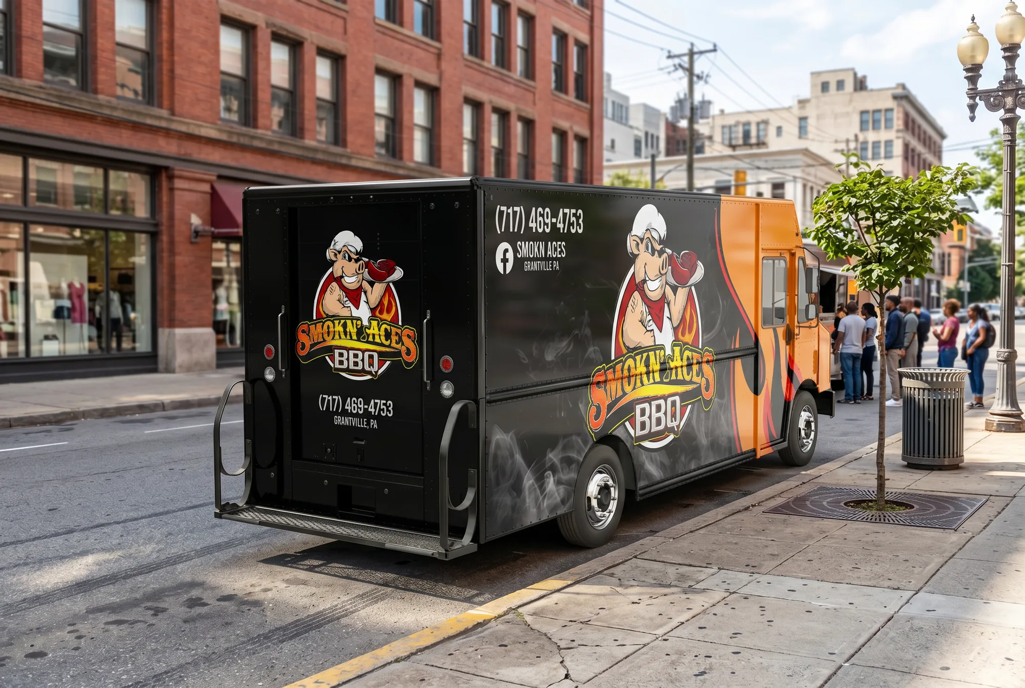
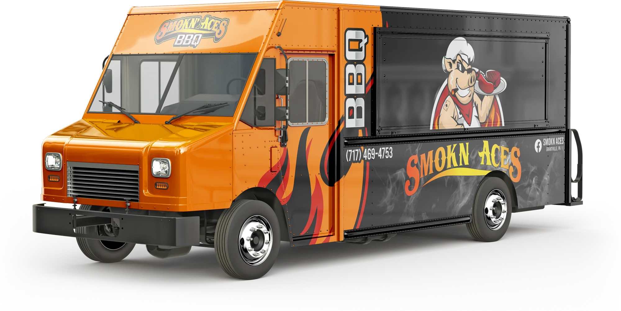
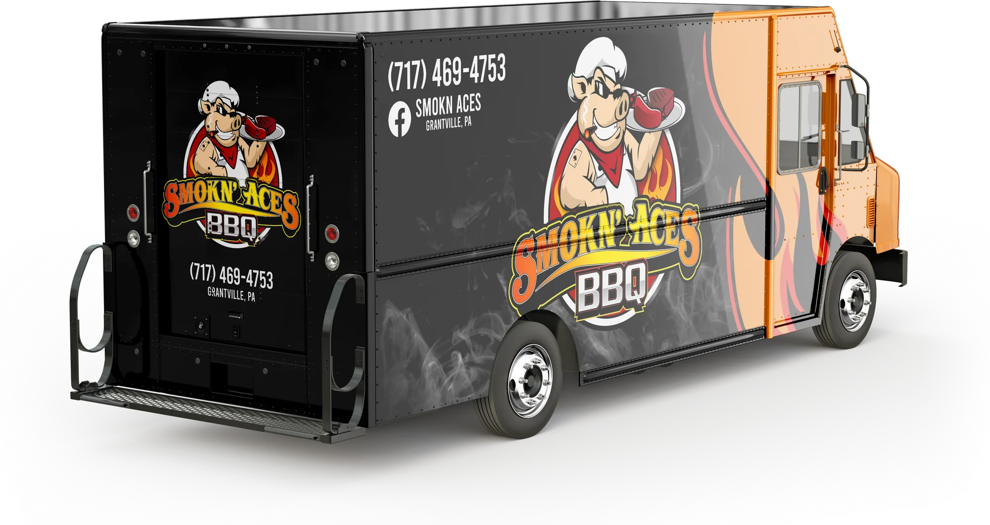
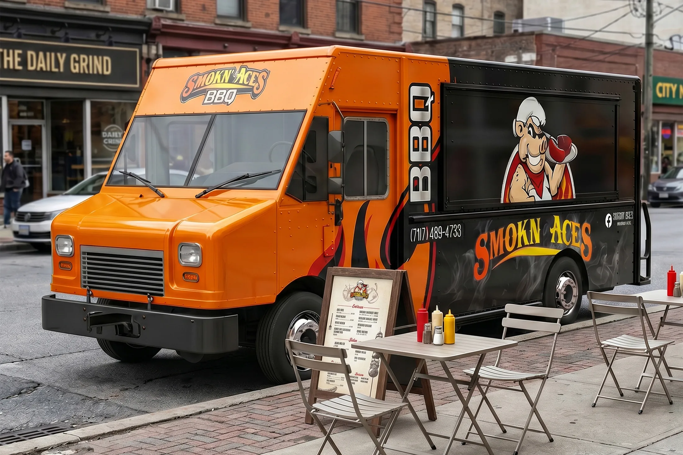
Because of the service window, the logo was split into two pieces: the pig on the window and the typography below it. That keeps the business name visible whether the window is open or closed. The two-tone flame pattern clearly says BBQ while creating eye-catching contrast.
Because it’s a character-based logo, keeping it large helps the pig stand out and makes the brand more memorable. The high color contrast carries around the entire vehicle.
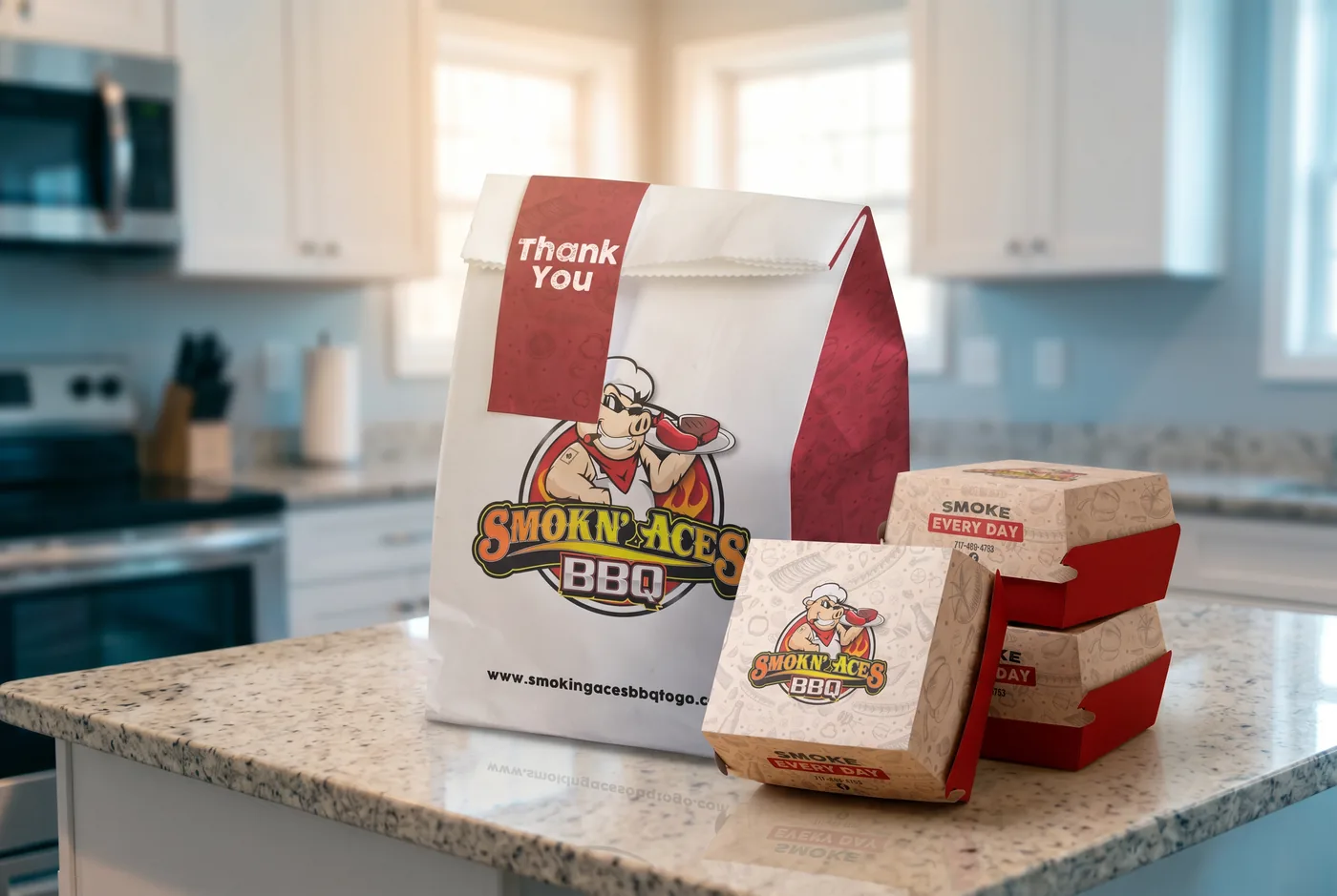
Takeout Packaging
Takeout Packaging
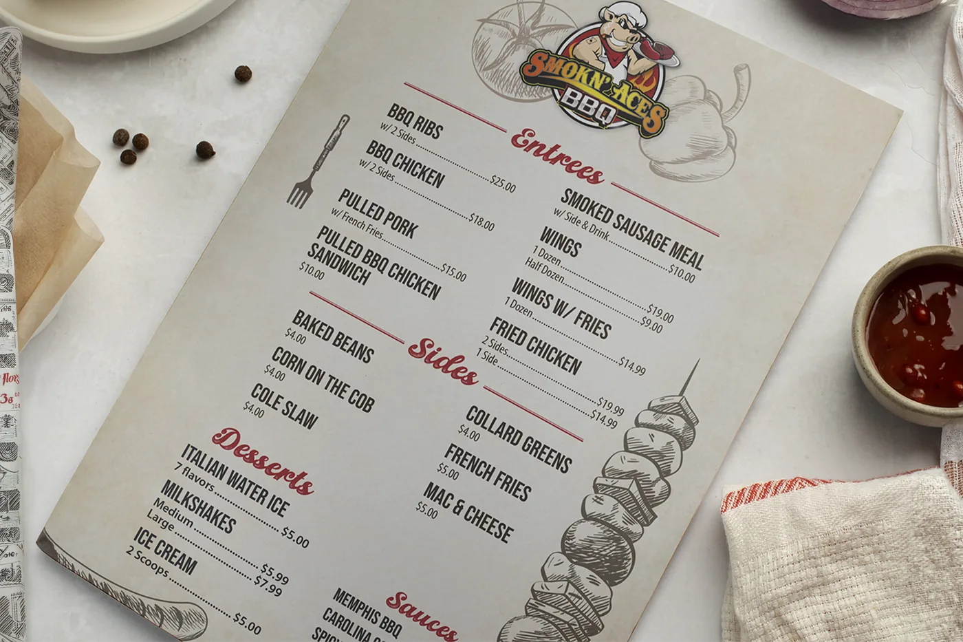
Menus
Menus
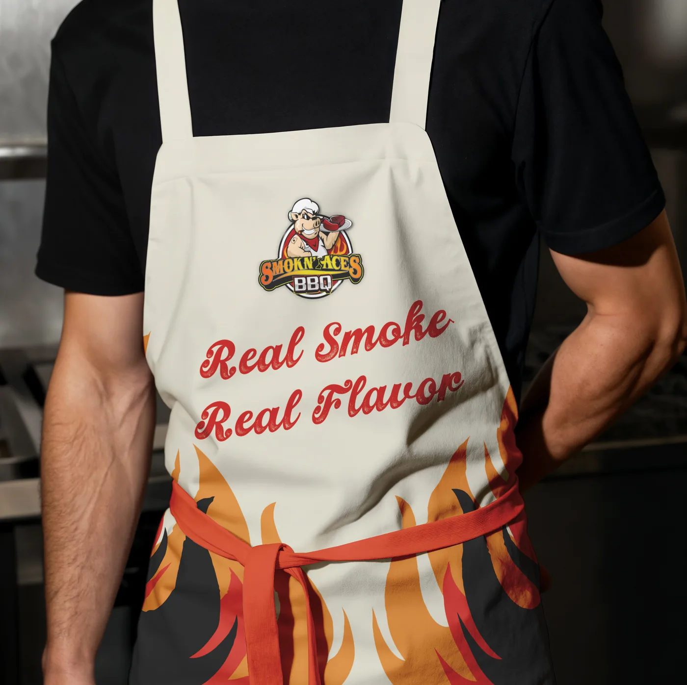
Apparel
Apparel
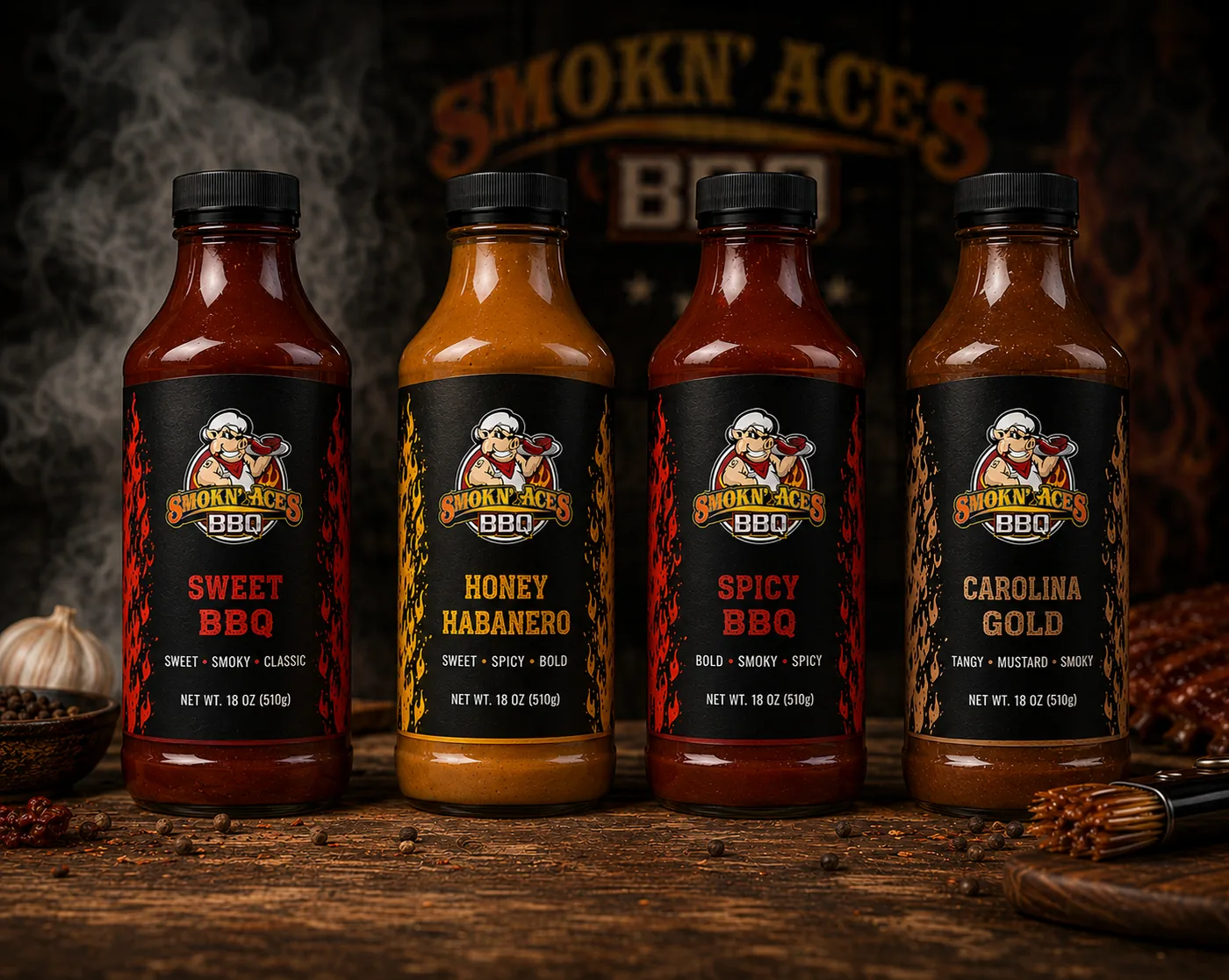
Sauce Bottles
Sauce Bottles
Events
Events
Catering
Catering

Next project
Trailbound
Brand identity proposal for an outdoor exploration and lifestyle brand.
Next project
Trailbound
Brand identity proposal for an outdoor exploration and lifestyle brand.
Next project
Trailbound
Brand identity proposal for an outdoor exploration and lifestyle brand.