01
Data Size
Data had to be presented so the most important information showed at the surface, while additional details stayed accessible at deeper levels.
01
This site map shows the app’s main pages. From each one, users can drill into more detailed information, such as how much they spent at a specific store.
02
In interviews with potential users, we identified four common themes. They shaped the design and clarified what users needed and wanted.
Users want a fast, at-a-glance summary of their money: what’s left, what’s spent, and where.
“I just want to open the app and immediately know if I’m on track this month.”
Manually entering data and categorizing expenses are slow and error-prone.
“I get lazy logging things manually, then the numbers don’t feel accurate.”
Users juggle banking, investing, credit cards, and payments across different apps.
“I wish I could see my bank accounts, credit cards, and investments in one place.”
Clear goals and visible progress motivate users to save and spend intentionally.
“Seeing progress toward my goals keeps me motivated to stay on budget.”
01
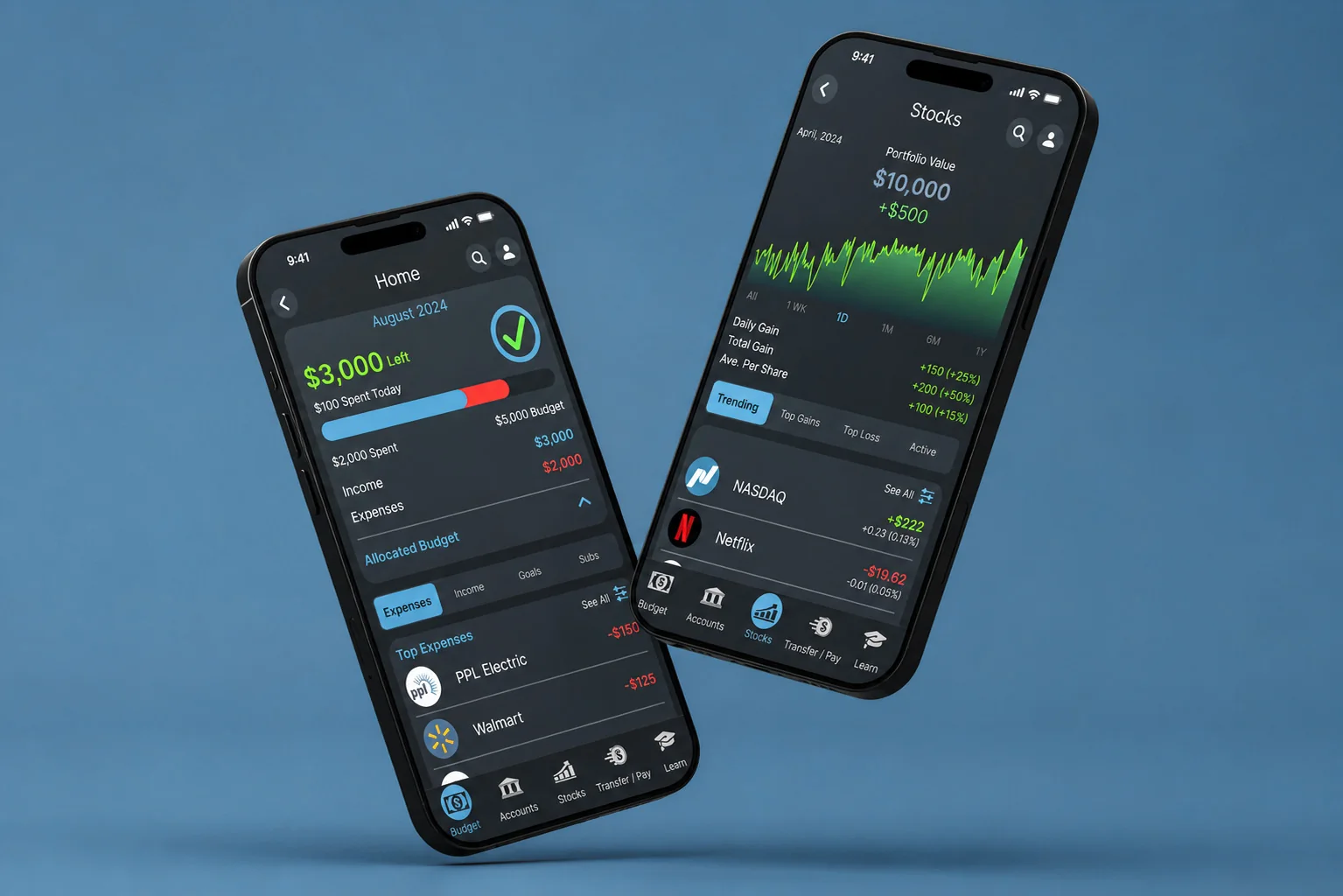
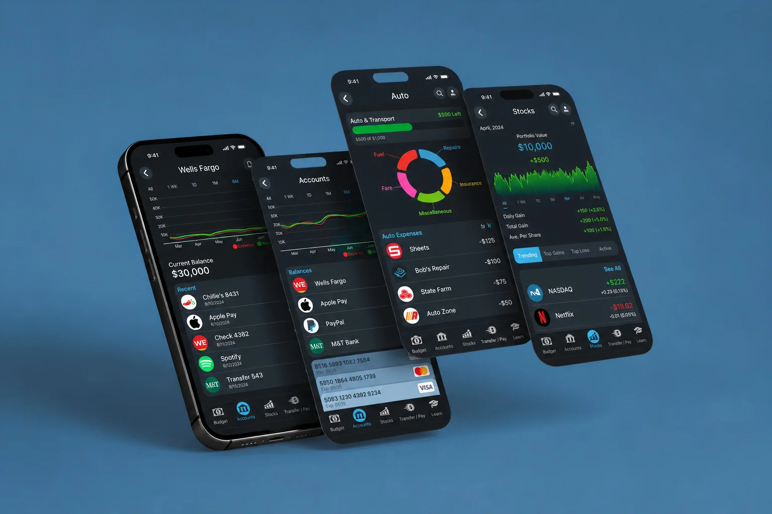
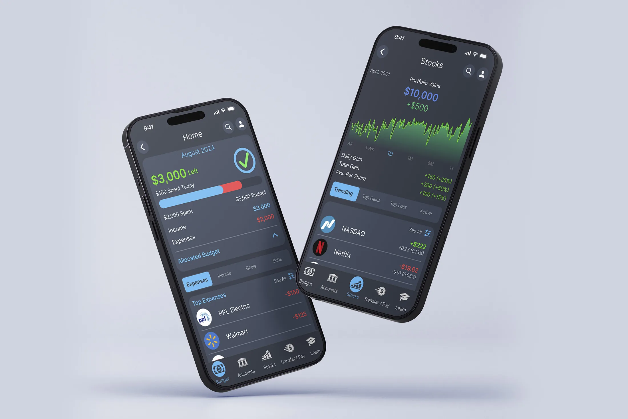
Start on the Budget screen. Tap PPL Electric to see every charge from that bill.
02
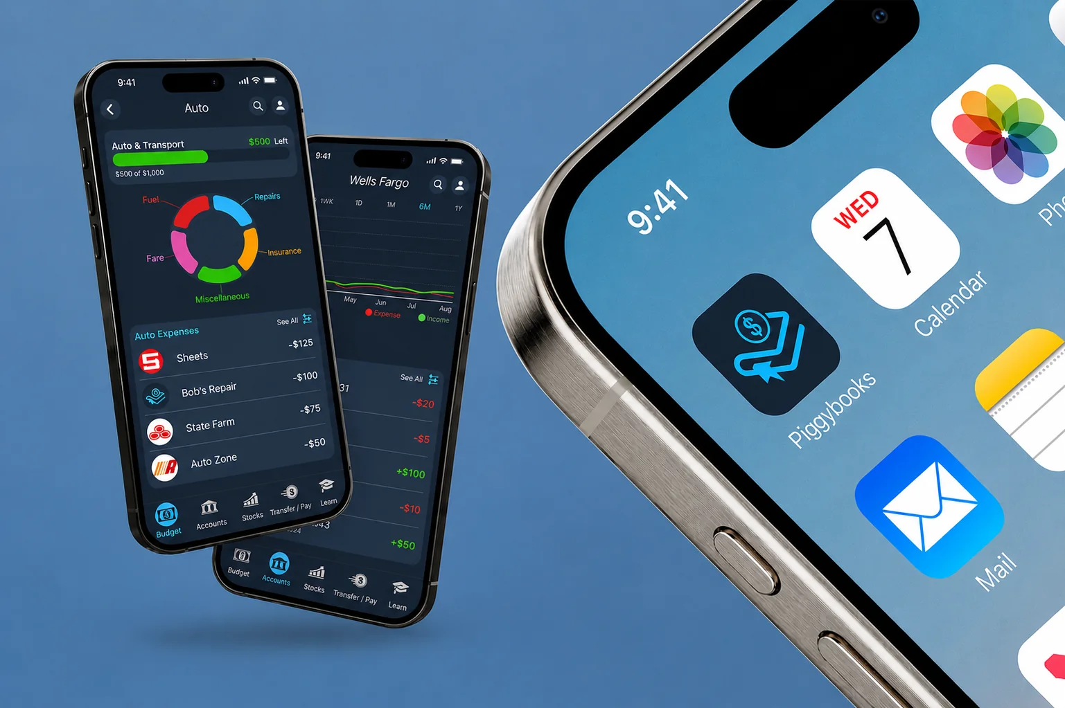
Go back and tap Auto & Transport to see its subcategories, then tap Sheetz.
03
Open Accounts from the bottom bar, then switch the chart’s timeframe.
04
Tap a card to expand its details. Tap it again to collapse it.
05
Open Stocks from the bottom bar and change the chart’s timeframe.
06
Tap GameStop to open that company’s detail view.