01
Established Brand
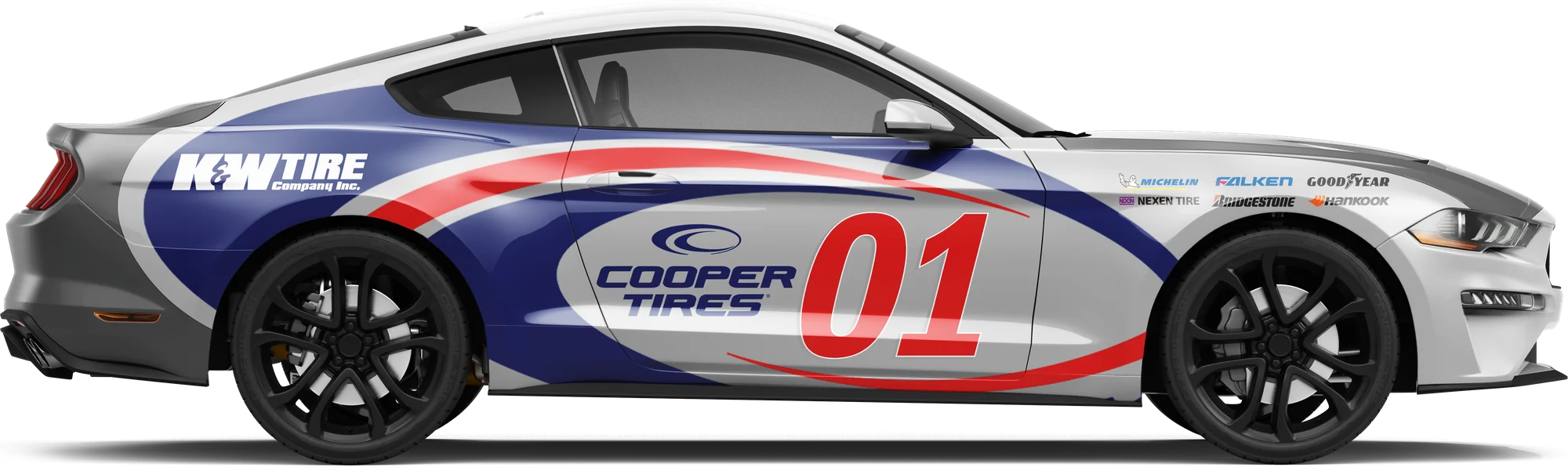
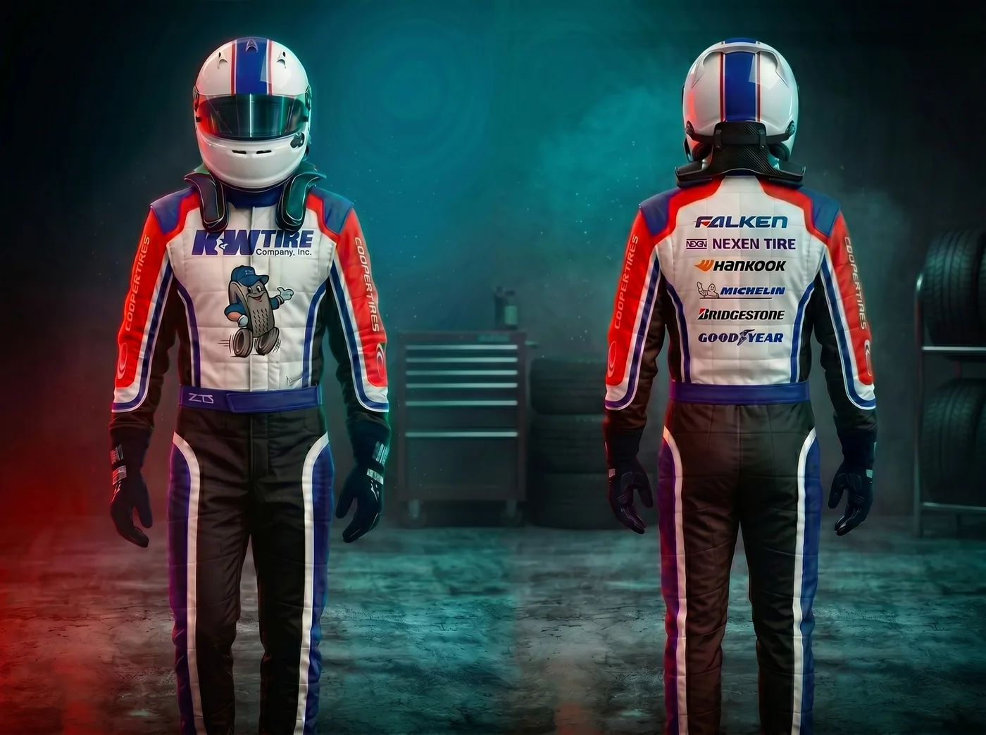
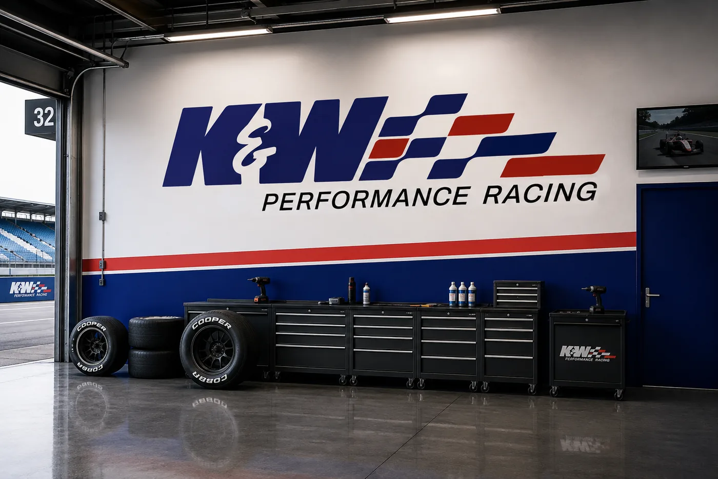
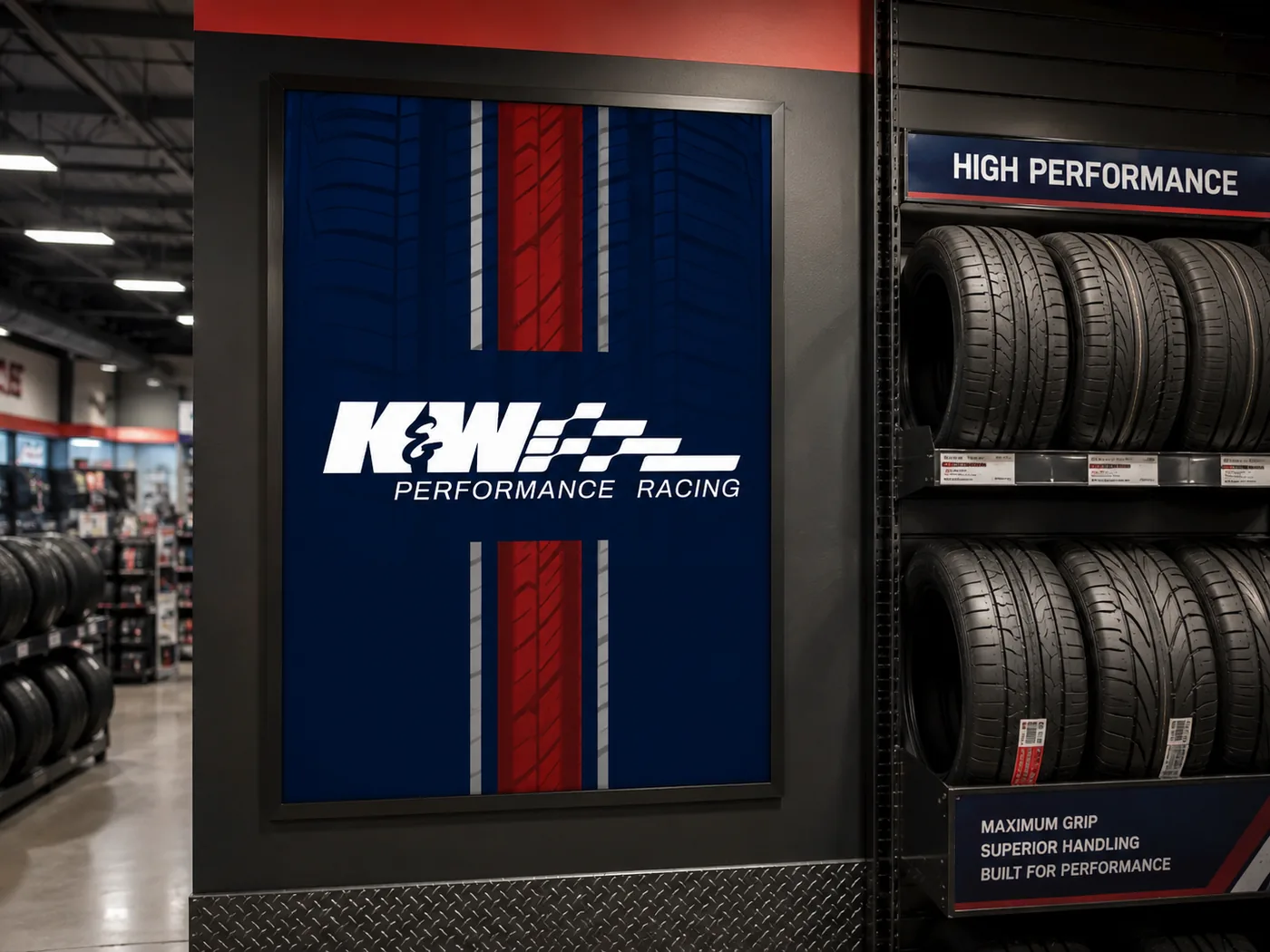
The design had to match K&W Tire’s existing branding, which limited color, typography, and overall promotional style.
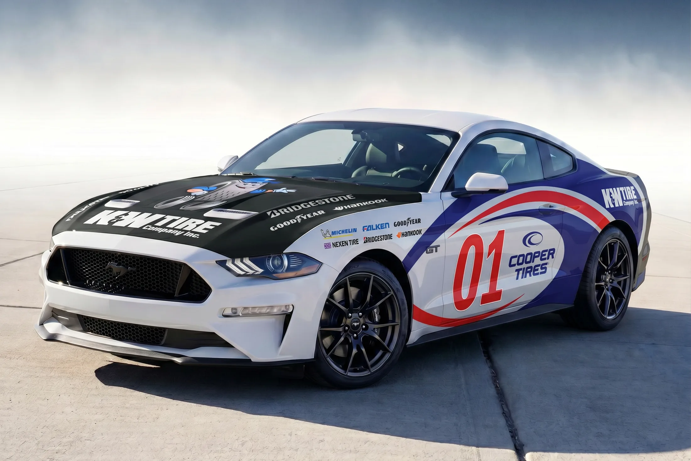
The Cooper swirl appears at a large scale, while a splash of red adds contrast and balances the blue against the rest of the palette.
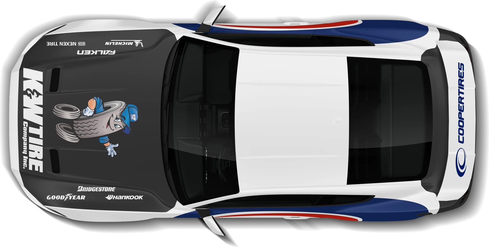
The top was designed so the car would be recognizable in aerial shots while maintaining the required branding hierarchy.
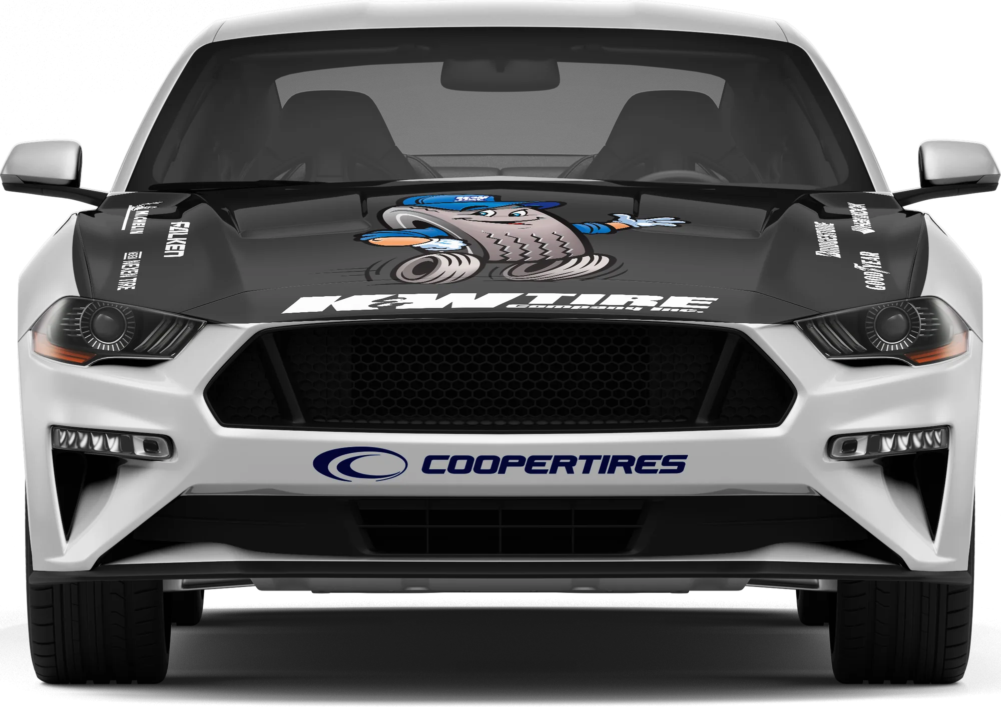
The K&W character is featured prominently on the hood, taking full advantage of the large, open space for branding.
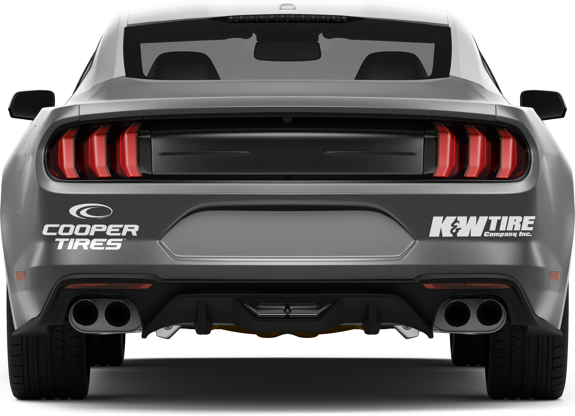
The gray rear caps off the car, completing a white-to-gray transition and creating a cohesive multitone contrast.

Full color

Single color
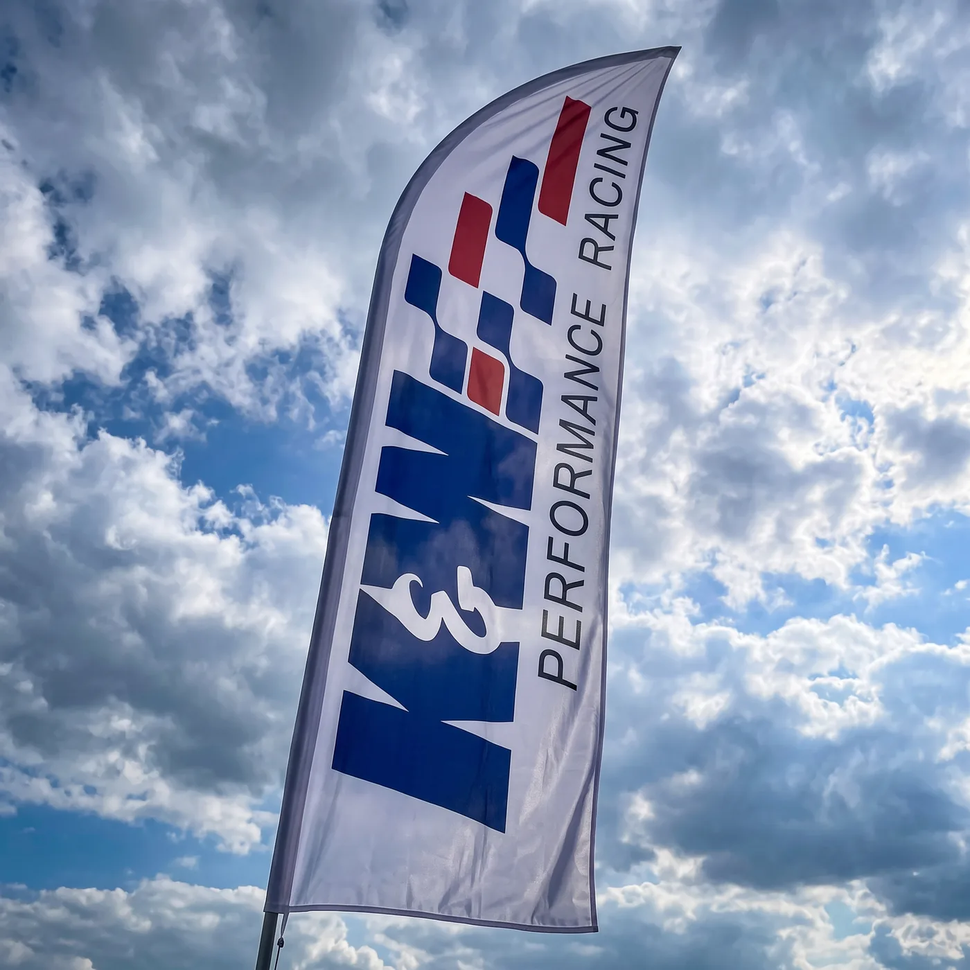
The racing logo is a simple extension of K&W Tire’s main logo, with a square pattern that suggests both tire treads and a racing flag, so it stays instantly recognizable as K&W. The words “Performance Racing” were set thin and wide to create a sense of momentum and to offset the weight of “K&W,” balancing the logo.
Tilt Warp
Headlines / Primary
Archivo
Body
H1
Headline Large
Tilt Warp · Titles
H2
Headline Medium
Tilt Warp · Subheadings
H3
Headline Small
Archivo · Small headings
Body
Body and small text
Archivo
These fonts and sizes were chosen for clarity and legibility in both print and digital applications.
K&W Blue
Primary · #292570
Red
Accent · #A32A1E
Slate
Neutral · #3D3D3D
White
Neutral · #FFFFFF
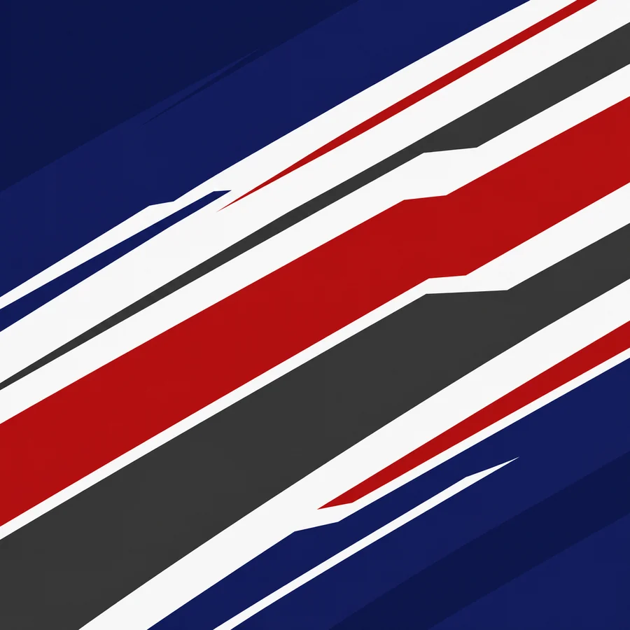
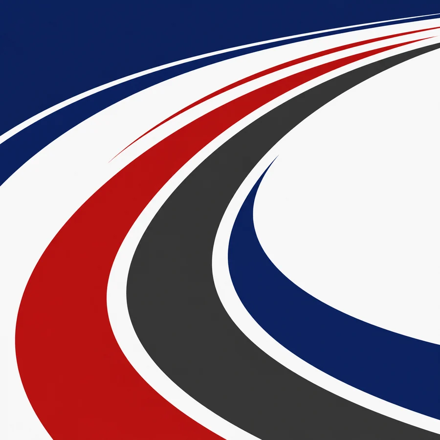
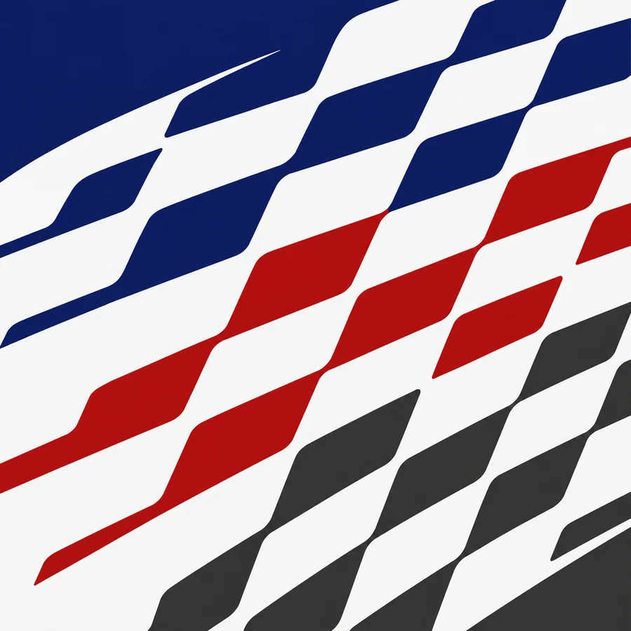
Because this was built around an established brand, K&W Blue had to be the primary color. Red was chosen as the accent, with Slate and White as neutrals. The Cooper swirl was a natural fit for the racing aesthetic and inspired the patterns.